
 EN
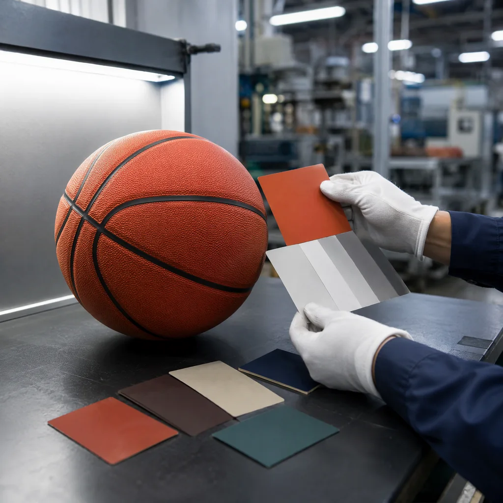
Custom Basketball Color Matching Guide
Custom basketball color matching requires more than sending a digital logo to a factory. The same color can look different on PU, rubber, foam-backed film, ink, or packaging board, and lighting can change the perceived result. For a B2B private-label program, the goal is not merely to find a close shade in a sample. It is to create a documented color standard that the factory can reproduce across panels, production lots, and future reorders.
Start with the right custom basketball color matching reference
Provide a current physical Pantone or brand standard whenever possible. Digital color values are useful for artwork but should not replace a physical reference because screens vary. Confirm whether the target is a coated, uncoated, textile, or custom standard. The reference should be clean, identified, and stored away from direct light and heat.
Explain the role of the color. A basketball logo, cover base color, printed stripe, and carton may require different materials and therefore different matching methods. The buyer should state which area is critical and whether a small, controlled visual difference is acceptable. Custom basketball color matching becomes easier when the approval hierarchy is clear.
Why custom basketball color matching changes with the substrate
Color is influenced by surface texture, gloss, opacity, and material thickness. A matte synthetic leather absorbs and scatters light differently from a glossy rubber cover. A dark backing can make a printed color appear deeper, while a white backing may increase brightness. Foam and adhesive layers can also affect how light travels through a film.
Ask the supplier to make a strike-off on the actual cover material. Do not approve a color on plain paper and assume it will transfer unchanged to a basketball. If the design uses several base colors, prepare a material swatch for each. The swatches should be labeled with ink or coating details, curing date, and production method. This substrate check keeps custom basketball color matching tied to the surface that customers will actually see.
Build a controlled custom basketball color matching approval sequence
Digital artwork proof
First check spelling, logo proportions, color names, and placement in the digital proof. This step is about artwork accuracy, not final color acceptance. Mark the file version and keep an approval record.
Physical color strike-off
Next inspect the color on the production substrate under agreed lighting. Compare the strike-off to the physical reference from several angles. Note whether gloss, texture, and surrounding colors influence perception. If the result is not acceptable, adjust ink, pigment, coating, or base material before making a full sample.
Finished basketball sample
The final sample reveals changes caused by curvature, stitching, inflation, and surface treatment. Inspect color in the same orientation used by customers and under more than one light source. A color that matches on a flat swatch may appear uneven at seams or over a rounded panel. Approve the finished sample with an identification number and retain it as the master. This finished-sample step is essential to custom basketball color matching because the assembled ball is the true approval surface.
Custom basketball color matching: lighting and measurement
Use a neutral viewing area with consistent light for formal approval. Daylight, cool white, and warm retail lighting may produce different impressions. If the order is sensitive, request instrumental readings such as Delta E, but do not treat a measurement as a substitute for visual review. The instrument must be calibrated, and the measurement location must represent the actual printed surface.
Record the light source, angle, substrate, and tolerance. When custom basketball color matching is judged by multiple teams, circulate the same physical standard rather than separate photographs. A single controlled reference prevents a factory, buyer, and warehouse from working toward different versions.
Controlling production variation
Color can drift with pigment batch, ink viscosity, screen condition, printing pressure, curing temperature, and surface preparation. The factory should inspect first-off production and retain a production swatch from each color. In-line checks can compare panels under the same light, while final inspection confirms color on the assembled ball.
Ask the supplier to segregate nonconforming color lots instead of blending them into a shipment. If a small variation is commercially acceptable, define its limit in advance. Rework can damage the cover, so a clear reject rule is often safer than repeated touch-ups. Documenting each decision makes custom basketball color matching repeatable instead of dependent on memory.
Planning custom basketball color matching for reorders
Use a color code, artwork version, substrate specification, and master-sample photograph in the purchase order. If another factory is added, send the physical reference and require a new strike-off. Never assume that a Pantone name alone will create identical results across equipment and materials.
Review the color at each reorder because raw materials and machines change. Store the master sample properly and replace it if it becomes faded or dirty. Keep records of approved deviations so a later buyer does not treat an intentional design choice as a defect. These records allow custom basketball color matching to remain consistent across factories and seasons.
Conclusion
Successful custom basketball color matching is a controlled path from physical reference to substrate strike-off, finished sample, production inspection, and reorder records. Define the lighting, material, tolerance, and approval authority before bulk production. With a durable color standard, B2B buyers can protect brand identity and reduce the costly arguments that arise when “the same color” means something different to every participant.